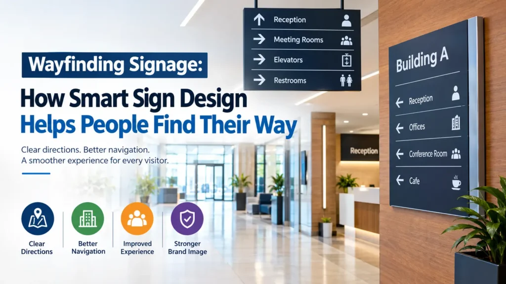
Finding the right building, department, entrance, or service should feel simple. Yet in large commercial spaces, even a well-designed building can become confusing when visitors cannot understand where to go. Clear directions, visible signs, and consistent visual information help people move confidently through unfamiliar environments.
Wayfinding signage plays a key role in creating that experience. From office buildings and hospitals to shopping centres, hotels, educational campuses, and outdoor public spaces, the right signage system helps visitors understand their surroundings without constantly asking for assistance.
A successful wayfinding system does more than display arrows. It combines readable typography, clear symbols, logical placement, colour coordination, and carefully planned information. When these elements work together, businesses can improve navigation, strengthen their professional image, and make their premises more welcoming.
This guide explains how wayfinding systems work, which sign types businesses need, how to plan an effective layout, and what to consider when choosing materials, finishes, and installation methods.
What Makes a Wayfinding System Effective?
Wayfinding is the process of helping people understand their location and choose the correct route to reach a destination. Signage supports this process by communicating directions, identifying places, and confirming that visitors are moving in the right direction.
Consider a visitor entering a large office complex for the first time. They may need to locate reception, find a particular floor, identify a meeting room, and eventually reach the correct exit. If signs provide useful information at each decision point, the journey becomes straightforward.
A good system answers three basic questions:
- Where am I? Location signs help visitors understand their current position.
- Where do I need to go? Directional signs indicate routes, entrances, departments, and destinations.
- Have I reached the right place? Identification signs confirm that visitors have arrived at the intended location.
These messages should work together rather than appear as unrelated signs. Consistent wording, familiar symbols, and a recognisable visual style make information easier to understand across the entire property.
The most effective systems also account for people with different needs. Visitors may speak different languages, have limited familiarity with the building, or rely on accessible design features. Planning for these circumstances improves the experience for a wider audience.
Why Businesses Should Invest in Better Directional Signage
Confusing layouts can create unnecessary frustration. Visitors may walk past entrances, enter restricted areas, arrive late for appointments, or interrupt staff to ask for directions. A carefully planned sign system can reduce these problems while improving the overall appearance of a commercial space.
Make First Visits Less Stressful
First impressions begin before a customer reaches the reception desk. Clear entrance signs, visible building numbers, and logical directional information help people feel confident as soon as they arrive.
This matters particularly for medical facilities, corporate offices, hotels, and large retail premises, where visitors may be unfamiliar with the layout.
Reduce Repeated Directional Questions
Receptionists, security teams, and other employees often spend time helping visitors locate common destinations. Well-placed signs can answer routine questions independently, allowing staff to focus on their main responsibilities.
The greatest benefit comes from positioning information where people need it, rather than expecting them to discover a directory after becoming lost.
Create a More Professional Environment
Signage is part of a property’s visual identity. Poorly matched signs can make a building feel disorganised, even when the architecture and interior finishes are attractive.
Coordinated lettering, carefully selected materials, consistent colours, and clean installation help create a polished environment that reflects the organisation behind the space.
Support Accessibility and Inclusion
Clear navigation benefits people with different mobility, vision, language, and cognitive needs. High-contrast text, understandable symbols, readable lettering, appropriate sign heights, and tactile or Braille information where required can make destinations easier to locate.
Accessibility requirements vary by building type and jurisdiction. Businesses should check the applicable standards before finalising their signage plan.
The Main Types of Signs Used in a Navigation System
A complete signage plan usually includes several sign types. Each serves a particular purpose, and the best combination depends on the building’s size, layout, visitor volume, and operating requirements.
1. Directional Signs
Directional signs guide people towards destinations using arrows, labels, floor numbers, or recognised symbols.
They are commonly installed at entrances, corridors, intersections, stairwells, lift lobbies, car parks, and outdoor pathways.
Effective directional signs provide enough information to support the next decision without overwhelming the reader. For example, a corridor sign might list reception, conference rooms, and visitor facilities instead of displaying every room in the building.
2. Identification Signs
Identification signs confirm the name or purpose of a particular location. Examples include room numbers, department names, office labels, reception signs, and floor identifiers.
These signs are especially useful when destinations look similar or when visitors must distinguish between several departments.
Dimensional lettering, acrylic panels, engraved plates, and metal signs can all provide attractive identification, depending on the environment and desired finish.
3. Directory Signs
Directories display several destinations in one place. They are useful in office buildings, hospitals, shopping centres, hotels, university campuses, and multi-tenant properties.
A directory might identify businesses on each floor, list departments, or show the location of shared facilities.
The information should follow a predictable structure. Grouping destinations by floor, department, or category makes the directory easier to scan. If the building changes frequently, modular panels or replaceable inserts can simplify future updates.
4. Informational and Regulatory Signs
Informational signs explain how a space operates. Regulatory signs communicate rules, restrictions, and required actions.
Examples include:
- No-entry and staff-only notices
- Lift and stairwell identification
- Accessible entrance information
- Parking restrictions
- Emergency exit instructions
- Reception and visitor check-in requirements
Some signs must meet specific legal or safety standards. Emergency exit signage and fire safety information should follow the relevant regulations rather than being treated as ordinary decorative graphics.
5. Outdoor Navigation Signs
Outdoor signs help visitors locate a building, choose an entrance, move through a site, or find parking.
They may include entrance markers, building numbers, directional posts, parking signs, campus maps, and vehicle access information.
Because outdoor signs face changing weather and lighting conditions, their materials, fixings, finishes, and visibility should be selected for the installation environment.
Choosing Materials That Suit the Building
Material selection affects appearance, durability, maintenance, and cost. A premium corporate reception may require a different finish from a busy hospital corridor or an exposed parking area.
| Material | Best suited for | Main consideration |
|---|---|---|
| Acrylic | Directories, room signs, reception displays | Available in many colours and finishes; surface care matters |
| Aluminium | Outdoor signs, directional panels, building identification | Lightweight and versatile when properly finished |
| Stainless steel | Premium interiors, corporate signs, durable identification | Offers a refined appearance; finish affects maintenance |
| PVC and other rigid plastics | Selected indoor applications and budget-conscious signs | Confirm suitability for wear, heat, and cleaning products |
| Vinyl graphics | Glass, walls, temporary directions, and existing panels | Surface preparation and installation quality affect longevity |
| Illuminated signs | Entrances and areas requiring stronger visibility | Requires suitable power, maintenance access, and glare control |
The correct material depends on the sign’s location, expected lifespan, cleaning routine, exposure to moisture, and visual requirements.
For example, brushed stainless steel may suit a premium office reception, while aluminium panels can be practical for outdoor directional posts. Acrylic may provide a clean, modern appearance for room identification and indoor directories.
Businesses should also consider whether the signs will need to change. A permanent sign may justify a durable custom fabrication, whereas frequently updated tenant information may be better served by a replaceable panel system.
How to Design Wayfinding Signage That People Understand Quickly
Good design is not simply about making signs attractive. The message must be understood quickly, particularly when people are walking, carrying belongings, or navigating an unfamiliar place.
Use a Clear Information Hierarchy
The most important information should be easiest to notice. Destination names, arrows, floor numbers, and other key details should have a logical visual order.
Avoid placing several competing messages at the same size. A visitor looking for reception should not have to search through a paragraph of secondary information to identify the correct direction.
Use concise wording and group related destinations together. If a message can be understood in fewer words without losing meaning, the shorter version is often preferable.
Select Readable Typography
Lettering must remain clear from the distance at which visitors are expected to read the sign.
Consider:
- Letter height and viewing distance
- Font weight and character spacing
- Contrast between text and background
- Lighting conditions and reflections
- The needs of people with reduced vision
Decorative fonts may look appealing on branding displays but can be difficult to read on directional signs. Simple typefaces with distinct letterforms are generally more practical for navigation.
Use Colours Consistently
Colour can help people recognise different floors, departments, or routes. For instance, a multi-level office complex might use a consistent colour for each floor across its directory, lift lobby, and corridor signs.
However, colour should not be the only way to communicate meaning. Text labels, numbers, arrows, and familiar symbols provide additional information for people who cannot easily distinguish certain colours.
Maintain sufficient contrast between the background and the message. Glossy finishes and reflective surfaces should also be assessed under the lighting conditions where the sign will be installed.
Place Arrows and Directions Carefully
An arrow must correspond to the route it indicates. Poor positioning, ambiguous angles, or inconsistent use of symbols can make visitors hesitate or choose the wrong corridor.
Directional information should appear before a decision point, not only after someone has passed it. At complicated intersections, a sign may need to show several destinations in a clear, prioritised order.
Review signs from the visitor’s actual approach direction. A design that looks correct on a computer screen may become confusing when mounted at a corner or viewed from a distance.
Planning a Complete Signage Layout
A reliable system starts with understanding how people move through the property. Ordering signs before mapping visitor routes can lead to missing information, duplicated messages, and unnecessary installation costs.
Step 1: Map the Visitor Journey
Begin at the point where visitors first arrive. This could be a car park, pedestrian entrance, reception area, lift lobby, or public transport access point.
Trace common routes from arrival to destination. Record every location where a visitor must make a decision, such as choosing a building entrance, turning into a corridor, or selecting a floor.
Think about different users. A delivery driver may need loading access, while a customer may need reception or a public entrance. Their routes should be clear without introducing unnecessary signs.
Step 2: Identify Decision Points
A decision point is any location where someone must choose between two or more possible routes.
Typical examples include:
- Building entrances and exit points
- Corridor intersections
- Lift and stairwell lobbies
- Car park junctions
- Reception and security desks
- Transitions between buildings or floors
Prioritise these areas when planning directional information. A sign positioned in an empty corridor may add little value if the confusing intersection immediately before it remains unmarked.
Step 3: Create a Sign Schedule
A sign schedule records each sign’s location, purpose, wording, dimensions, material, finish, and installation method.
It helps designers, fabricators, installers, and property managers work from the same information.
A simple schedule can include:
| Sign location | Purpose | Information required |
|---|---|---|
| Main entrance | Welcome and orientation | Building name, reception direction |
| Reception | Visitor guidance | Check-in instructions, directory |
| Lift lobby | Floor selection | Floor numbers and key destinations |
| Corridor junction | Route selection | Arrows and destination names |
| Department entrance | Location identification | Department name or room number |
| Car park | Vehicle guidance | Entrance, exit, accessible parking, restrictions |
The final schedule should reflect the actual site layout and any required safety signage.
Step 4: Test the Wording and Layout
Review the proposed system from the perspective of someone who has never visited the building.
Can they find the main entrance? Do they know which floor to choose? Is the next direction visible before they reach a junction? Does each sign use the same destination name as the directory?
These checks often reveal problems that are easy to overlook during design.
Step 5: Install and Review
After installation, walk through the property using the intended visitor routes. Check viewing distances, mounting heights, lighting, reflections, visibility from different approaches, and any obstructions.
If possible, ask people unfamiliar with the building to complete a simple route without assistance. Observe where they pause, turn around, or ask for help. Their experience can reveal practical improvements before the signage plan is considered complete.
Common Mistakes That Make Signs Less Effective
Even well-manufactured signs can fail when the planning is weak. Avoiding a few recurring mistakes can improve clarity and reduce the need for costly changes.
Too much information: A sign containing every possible destination becomes difficult to scan. Display the information needed at that particular location and direct visitors to a directory for additional details.
Inconsistent destination names: If a directory says “Meeting Suite” but corridor signs say “Conference Rooms,” visitors may wonder whether they are different places. Use consistent naming throughout the building.
Poor placement: Signs hidden behind doors, furniture, plants, or other displays cannot guide people effectively. Check sightlines from the actual approach direction.
Weak contrast: Similar text and background colours can make information difficult to read. Review contrast in both natural and artificial lighting.
Unplanned future changes: Businesses often move departments, add tenants, or change room functions. A system with no provision for updates can become inaccurate quickly.
Ignoring accessibility: Navigation should not depend entirely on small text, colour coding, or information placed beyond comfortable reach. Consider accessibility requirements at the planning stage rather than attempting to correct them after installation.
Treating safety signs as decoration: Emergency and regulatory signage must communicate clearly and comply with applicable standards. Decorative styling should never compromise its required function.
How to Balance Branding with Practical Navigation
Commercial signage often needs to communicate a brand identity while remaining easy to understand. These goals can work together when branding supports the message instead of competing with it.
A hotel, for example, may use its brand colours, logo, and premium metal finishes across reception displays and floor directories. The directional arrows and destination names can retain a simple, consistent design so visitors can find their way quickly.
Dimensional lettering can add depth to reception signs, corporate identification, and selected destination markers. Illuminated lettering may improve visibility in certain entrances or low-light settings, provided brightness, glare, and energy requirements are considered.
A useful approach is to separate primary navigation from decorative branding. Main directional signs should prioritise legibility, while feature signs can provide more room for logos, distinctive finishes, and visual details.
The result is a coherent environment where the signs feel connected to the business without making navigation harder.
Maintenance and Long-Term Performance
A sign system needs ongoing attention to remain accurate and useful. Even durable materials cannot compensate for outdated information or damaged panels.
Establish a regular inspection schedule and review signs whenever the building layout changes. Property teams should check for fading, loose fixings, damaged surfaces, blocked sightlines, and incorrect room or department names.
Cleaning requirements vary by material. Use products recommended for the selected finish, as harsh chemicals can damage acrylic, printed graphics, protective coatings, or illuminated components.
For signs that include lighting, ensure that electrical components can be inspected and maintained safely. Outdoor installations may also need periodic checks for water ingress, corrosion, and mounting stability.
Keep the sign schedule updated so replacement panels and future additions match the existing system. Consistency is easier to maintain when the organisation has a clear record of sign specifications, approved wording, and installation locations.
What to Consider When Hiring a Signage Company
Selecting a signage provider involves more than comparing prices. The company should understand the intended use of each sign and how the full system will work within the building.
Before approving a project, consider the following:
- Design capability: Can the provider develop a consistent visual system for multiple locations?
- Material knowledge: Can they explain which materials and finishes suit indoor, outdoor, and high-traffic environments?
- Fabrication quality: Are lettering, edges, finishes, fixings, and illuminated elements produced to an appropriate standard?
- Installation planning: Will the proposed mounting methods suit the wall, glass, post, or other surface?
- Accessibility and compliance: Can the provider work to the applicable signage and safety requirements?
- Future updates: Can room names, tenant details, or directories be changed without replacing the entire system?
- Project coordination: Are artwork approval, measurements, production, installation, and final inspection clearly defined?
Request drawings or mock-ups for important signs before fabrication begins. Confirm wording, dimensions, colours, materials, mounting positions, and any lighting requirements in writing.
For larger premises, it can also be useful to review a sample sign or finish before approving the complete order. This allows stakeholders to assess readability and appearance under realistic conditions.
Frequently Asked Questions
1. What is the main purpose of wayfinding signage?
The main purpose is to help people understand where they are, identify their destination, and follow the correct route. It can include directional arrows, building directories, room identification, floor numbers, and location markers. When the information is consistent and positioned at the right points, visitors can navigate unfamiliar spaces with less confusion and fewer interruptions to staff.
2. Which businesses benefit most from navigation signs?
Hospitals, hotels, shopping centres, offices, universities, airports, industrial facilities, and public buildings often benefit greatly because they serve visitors who may not know the layout. Smaller businesses can also benefit when entrances are difficult to identify, several departments share one building, or customers need directions from parking areas to reception.
3. Which materials are suitable for indoor and outdoor signs?
Acrylic, aluminium, stainless steel, rigid plastics, and vinyl graphics are all used for different applications. Indoor signs can prioritise appearance and ease of cleaning, while outdoor signs require suitable weather resistance, secure fixings, and durable finishes. The best option depends on exposure, expected lifespan, maintenance requirements, budget, and the surface where the sign will be installed.
4. How can signage improve accessibility?
Accessible design can include readable typography, strong contrast, clear symbols, suitable mounting heights, tactile lettering, and Braille where required. Routes should also account for people using mobility aids and those who may have difficulty reading small text. Applicable accessibility regulations vary by location and building type, so requirements should be checked before the design is approved.
5. How many directional signs does a building need?
There is no universal number. The quantity depends on the building’s layout, number of entrances, visitor routes, floors, intersections, and destinations. A site survey can identify decision points where information is necessary. The aim is to provide directions at the right moments without filling every wall with signs or overwhelming visitors with unnecessary information.
6. Can navigation signs match a company’s branding?
Yes. Brand colours, logos, typography, and materials can be incorporated into a consistent signage system. However, directional messages must remain easy to read, and decorative features should not compete with arrows or destination names. A practical design uses branding to create visual consistency while keeping navigation information clear, accessible, and easy to recognise.
7. How often should a signage system be reviewed?
Review the system whenever departments move, room names change, new areas open, or visitor routes are altered. Regular inspections can also identify damaged panels, faded graphics, loose fixings, and blocked sightlines. A documented sign schedule helps property managers keep information accurate and makes it easier to replace or update individual signs without redesigning the entire system.
8. What should be included in a signage project quotation?
A detailed quotation should identify the sign types, dimensions, materials, finishes, artwork, fabrication methods, installation requirements, and any lighting or electrical work. It should also clarify site surveys, approvals, delivery, installation access, and maintenance responsibilities where applicable. Comparing quotations against the same specification makes it easier to assess quality and understand the true project cost.
Final Thoughts
A well-planned signage system helps people move through a building with confidence, reduces unnecessary confusion, and creates a more professional visitor experience. Its success depends on more than attractive materials or distinctive lettering. Clear wording, logical placement, readable typography, consistent design, accessibility, and accurate information must all work together.
For businesses planning a new installation or improving an existing property, wayfinding signage should be treated as part of the overall visitor journey. Start by understanding how people arrive, where they need to go, and which decisions cause the most uncertainty. Then choose signs that answer those questions clearly and suit the building’s practical requirements.
With thoughtful planning, appropriate materials, and regular maintenance, a signage system can remain useful, attractive, and easy to follow for years to come.